Aequivalent
I created three different interfaces for the background check company Aequivalent.
For confidentiality purposes, some names, data and information have been changed.
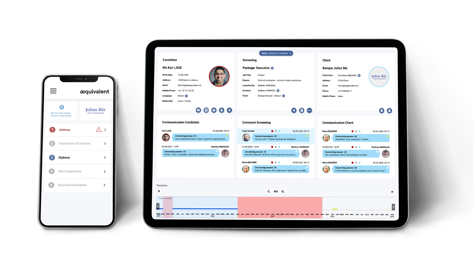
The challenge
The challenge was to design a new version of the Aequivalent software; A desktop-first app that allows candidates, big companies and Aequivalent itself to accurately receive, check, list, and flag job applicants. An accurate reception, process and listing of these applicants is critical to the success and profitability of these businesses.
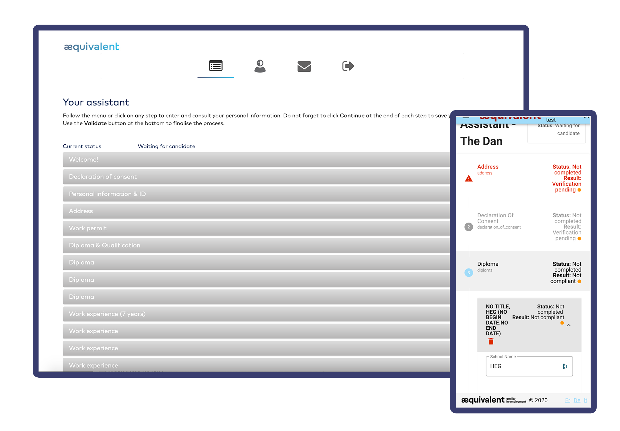
Currently the way Aequivalent is doing it is through their first, outdated and hard-to-use application.
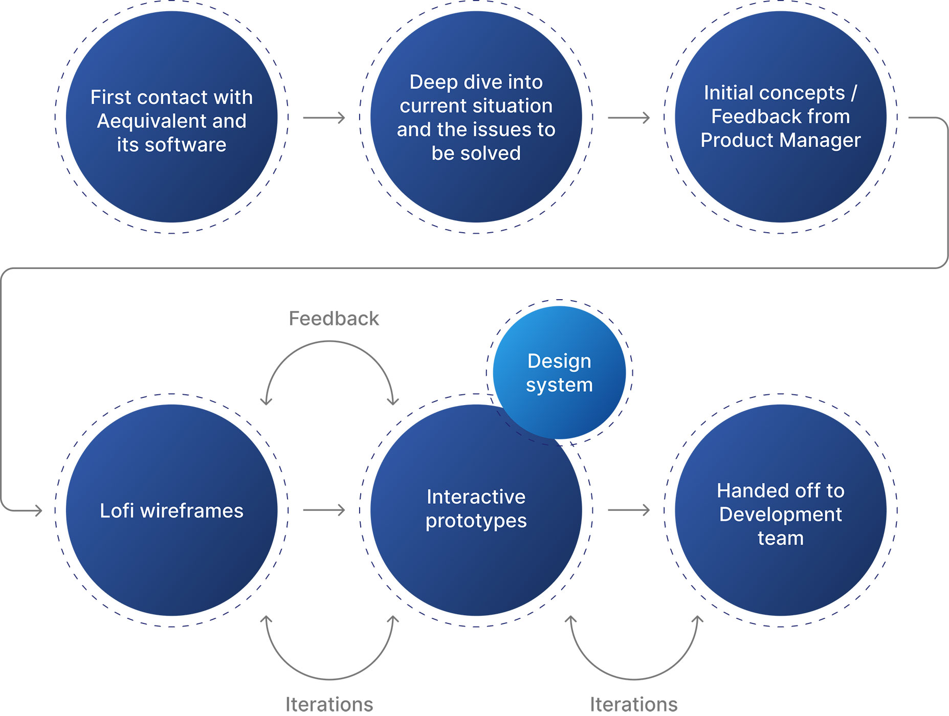
The client and the team
Aequivalent SA is a company which performs background checks. It basically provides employers verified data on potential future employees by performing a "screening".
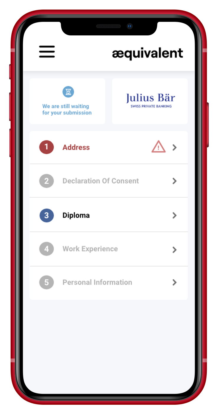
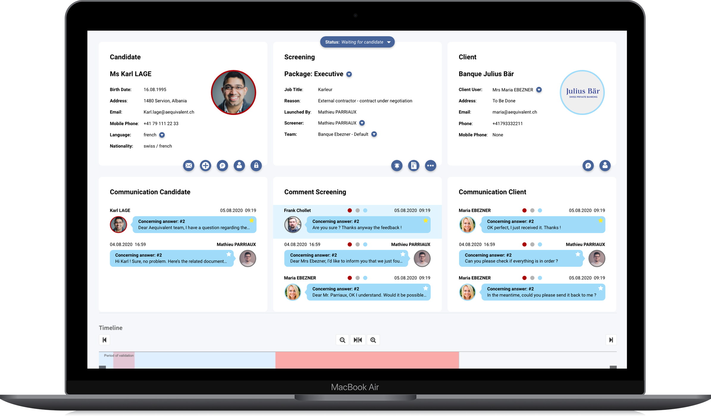
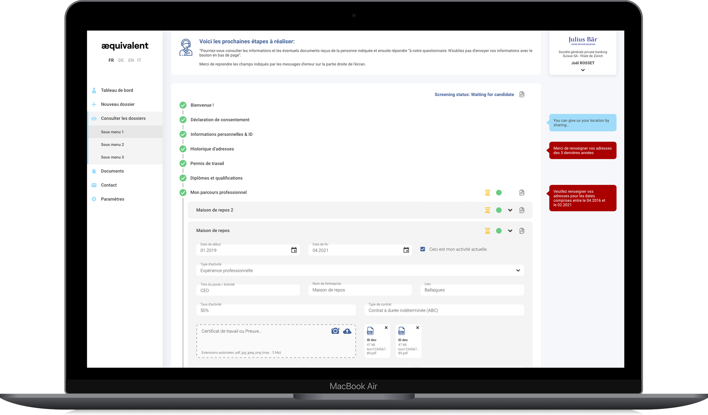
This involves providing a candidate, a client and the company three different interfaces which I've designed:
- The candidate interface (job seeker)
- The client interface (hiring company)
- The company (Aequivalent)
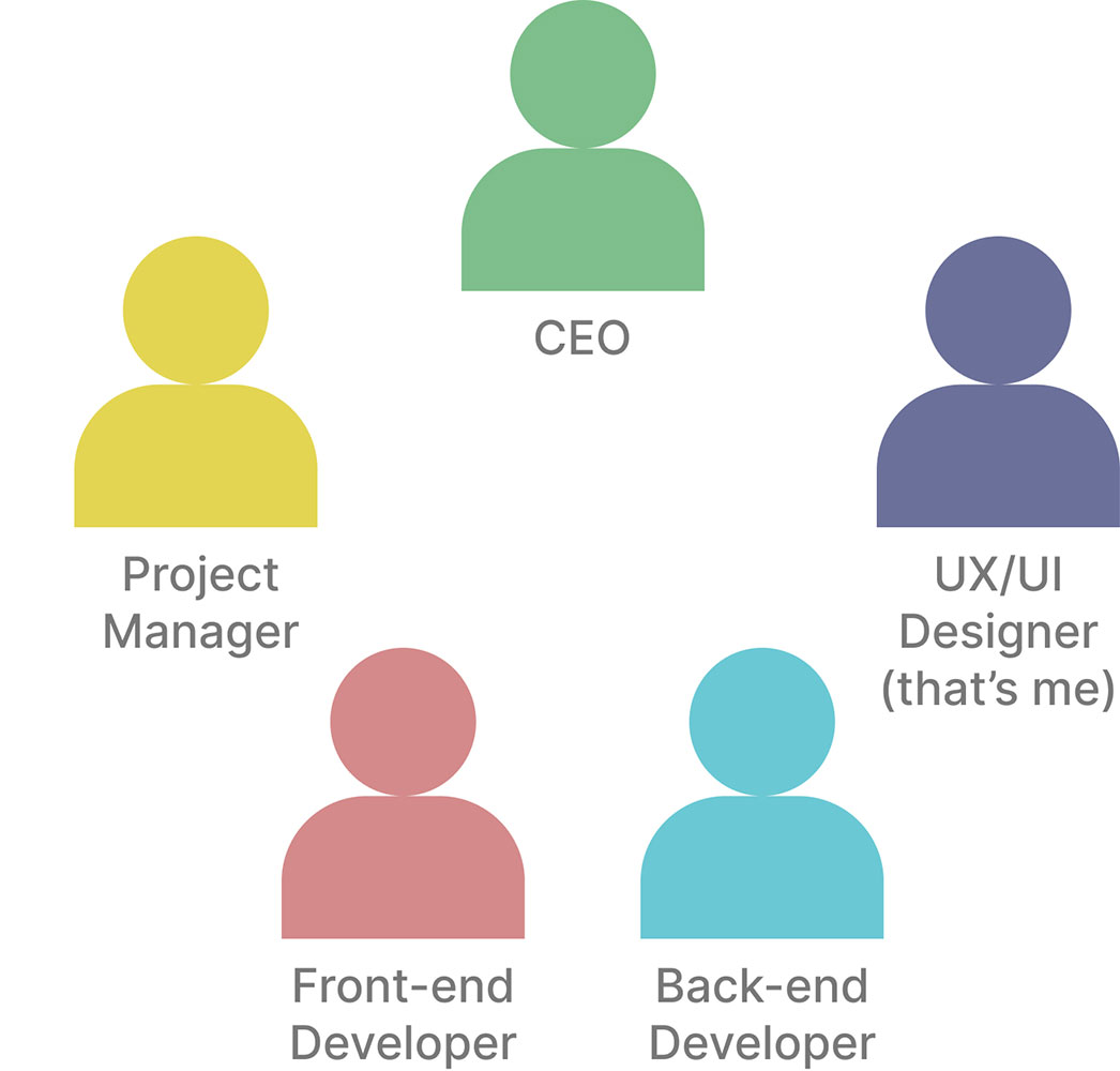
The team was composed by the CEO, the Project Manager, a Front-end developer, a Back-end developer and myself as a UX/UI Designer. During the project, I got to work more with the Project Manager and the Front-end Developer than the rest, depending on needs.
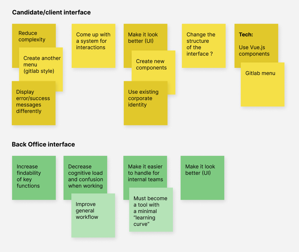
The problems
The current interfaces had problems in various places, which hindered the user experience, as well as the business performance.
Personas and testing
Aequivalent is lucky enough to have a lot of customers. This meant that all the work was based on real customer feedback and interaction. This feedback was gathered through 1-on-1 chats between the product manager or support staff and the customer.
While customer feedback can sometimes be skewed, the team at Aequivalent were experienced enough to know which information was valuable and which to skim over.
The diverging phase
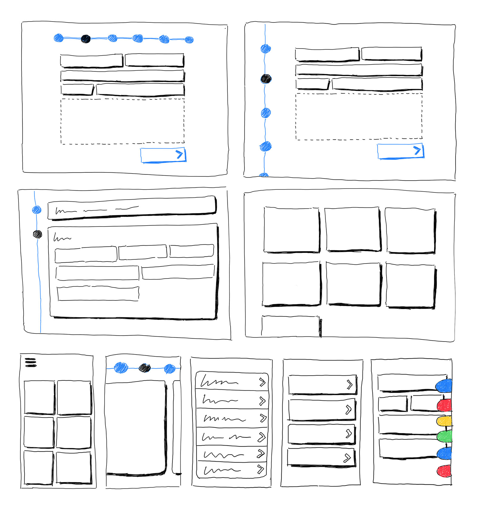
Sketches are a great, quick and cheap way to open up new possibilities and rethink how things work.
I particularly enjoy sketching with the user in mind: what problem am I going to solve for that particular person ?
I presented a couple of sketches to the team (a little more than those right here ;) ) and we started to think about new ways the app could work, new flows and new systems. It was a team decision in the end.
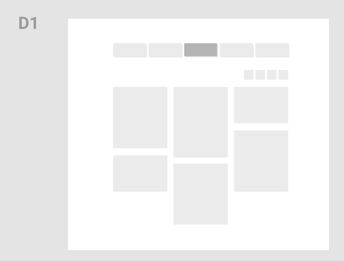
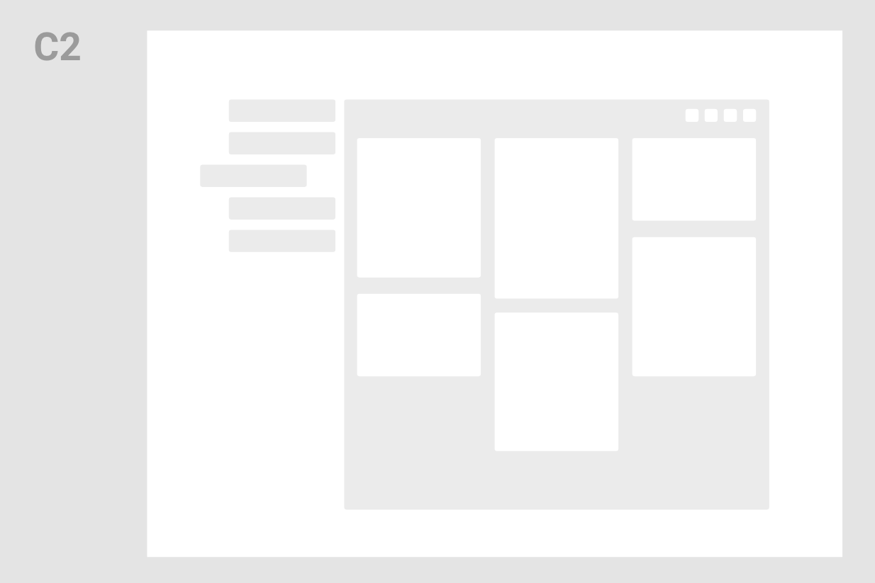
Concepts and new structures
I created a variety of new structures and concepts in order to achieve the following goals:







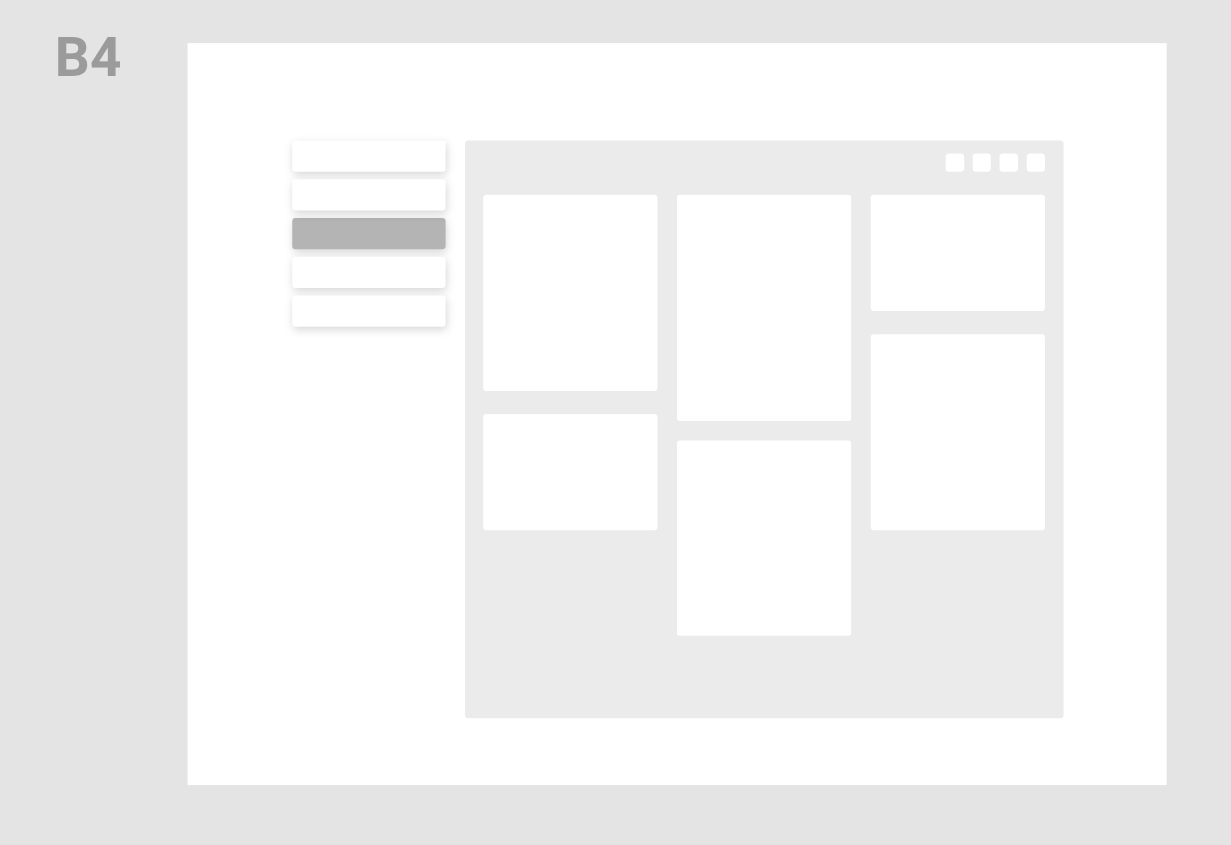
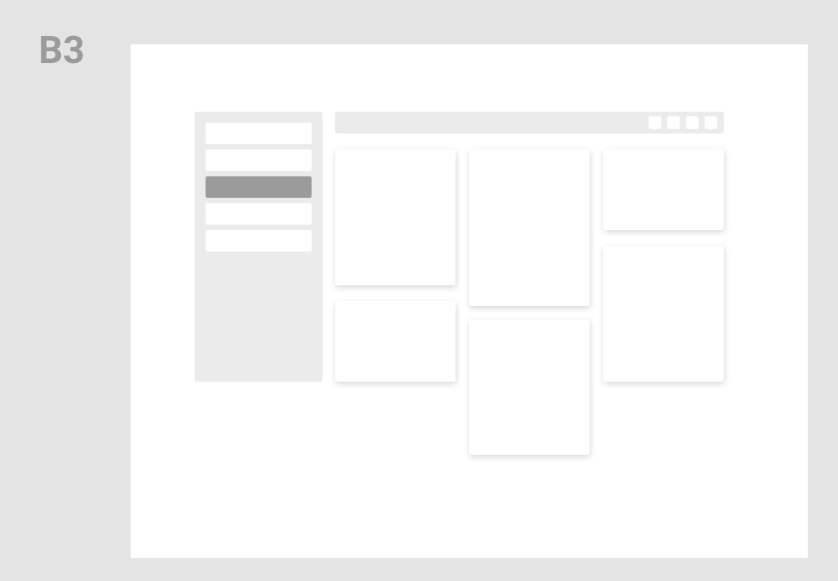
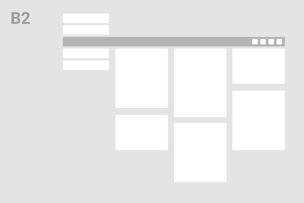
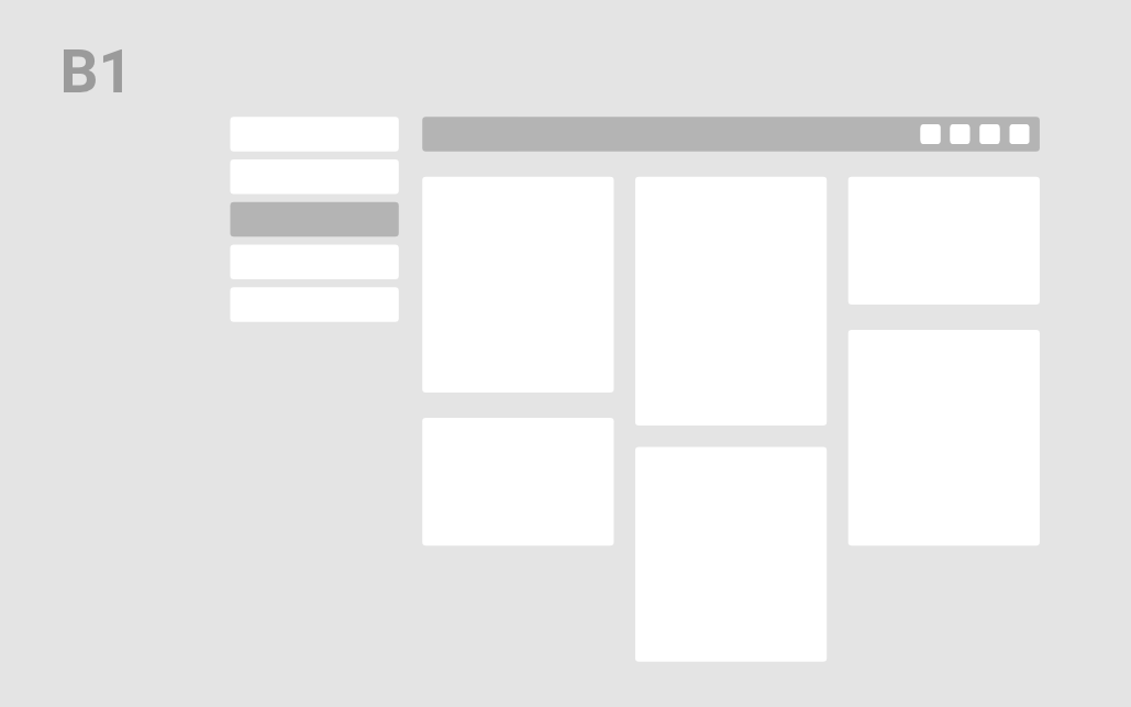
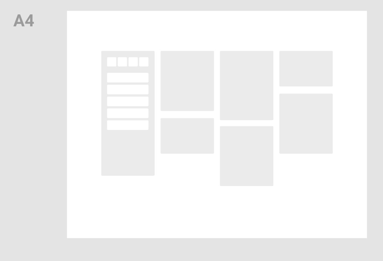
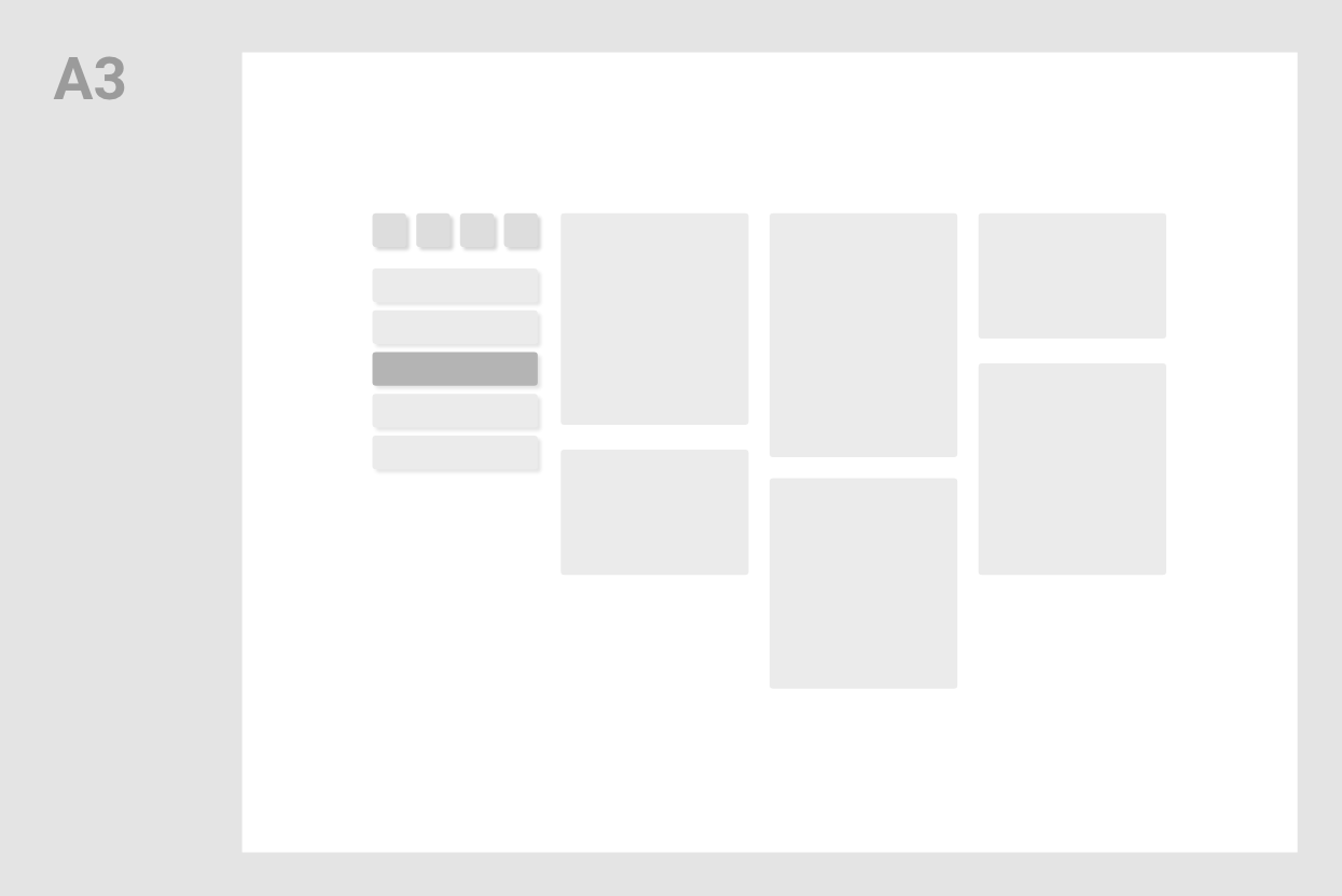
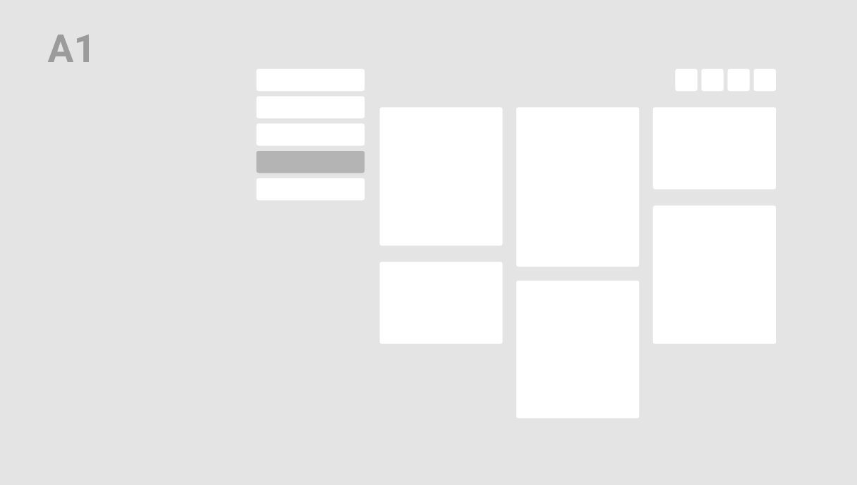
Creating the design system
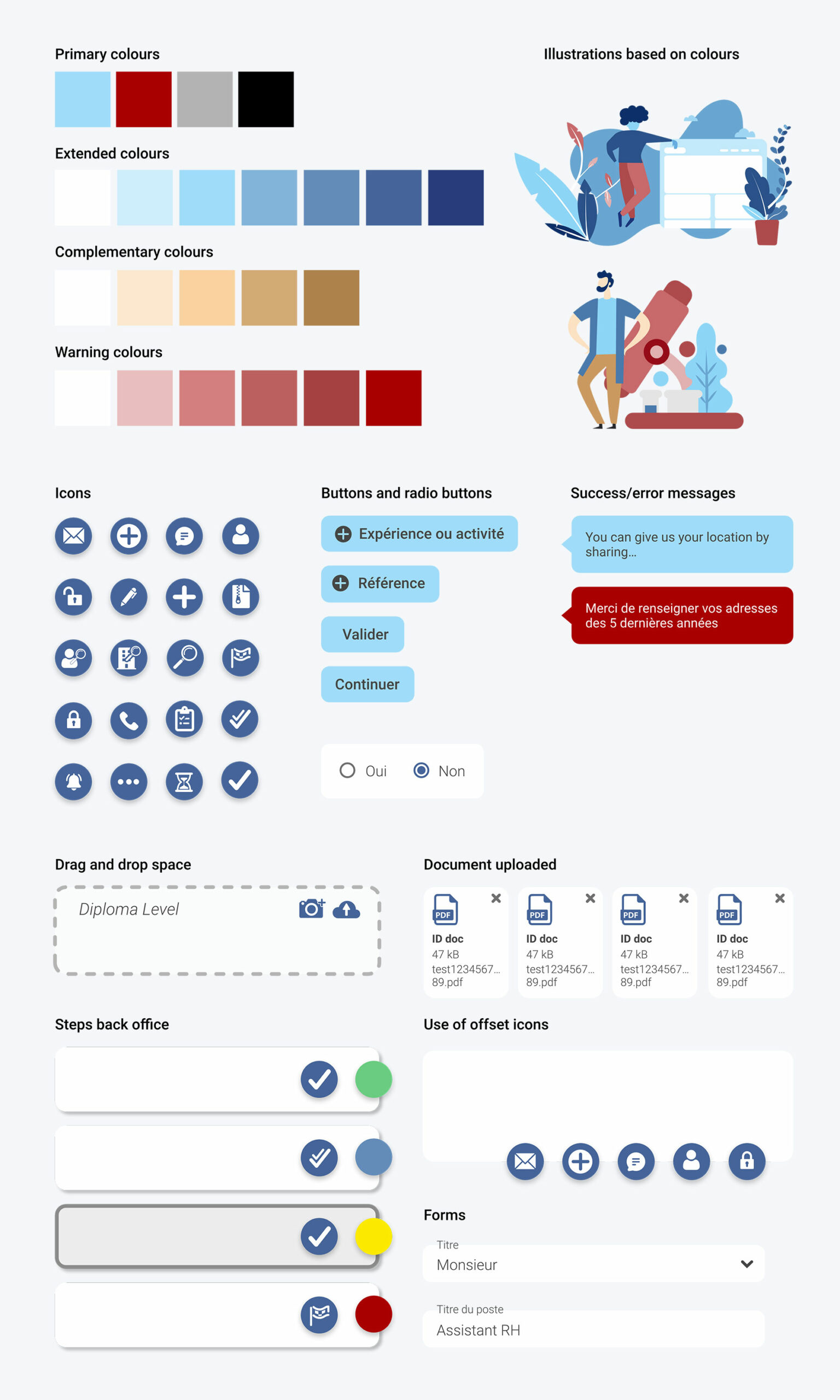
I was responsible for initiating and evolving the design system, but the real work involved a back-and-forth collaboration with the entire team to align the brand on these digital components.
For development purposes, we used Vuetify (VueJS) elements to save time and implement faster. I was the one responsible for the selection of components.
Mobile & desktop interactive prototypes
Since this project was desktop-first interfaces (and due to the management choices), I haven't spent a lot of effort on the mobile part.
I still addressed the problem of the vertical scrolling system we had in the desktop version. I designed a system of horizontal scrolling which switches pages on touch, much like the ones you find on iOS.
You'll find the desktop high-fidelity interactive prototypes below.
