The challenge
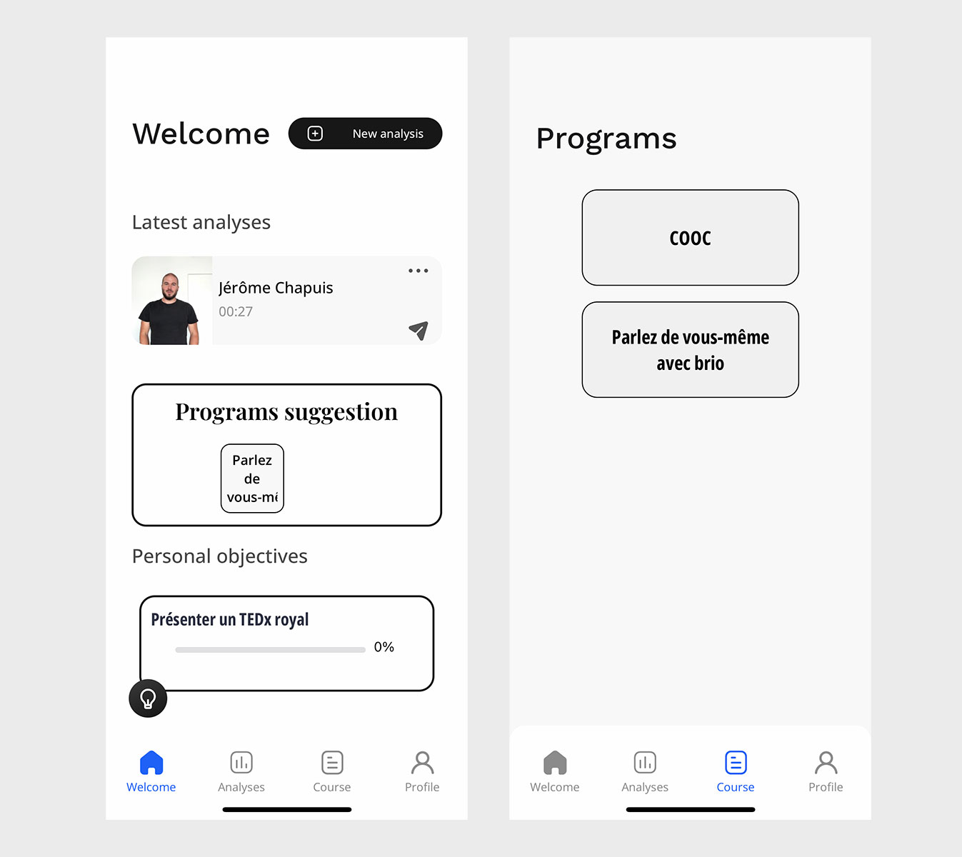
The challenge was to design a second version of the Talk mobile application. This app must allow user to learn, train and interact with Artificial Intelligence in improving their speaking skills.
At the beginning of this project, Talk was doing it is through their first, outdated and hard-to-use mobile application.
The client and the team
Talk is an education company specialized in public speaking/communication. It basically provides students, leaders and managers the tools to lead correctly and gather the necessary confidence to shine in public and in any social environment.
This involves providing teachers and students a digital way of learning, both through an app and an administration console.
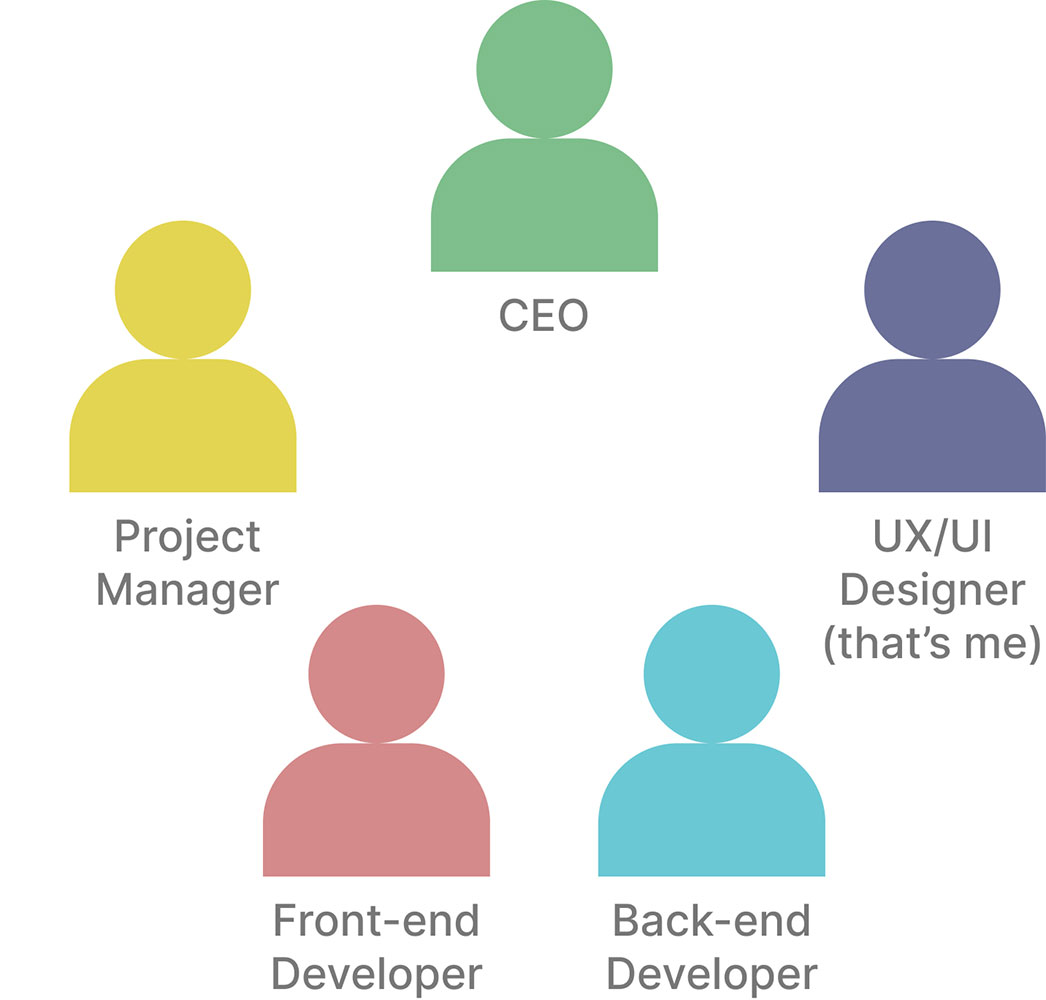
The team was composed by the CEO, the Project Manager, a Front-end developer, a Back-end developer and myself as a UX/UI Designer. During the project, I got to work more with the CEO and the Back-End Developer than the rest, depending on needs.
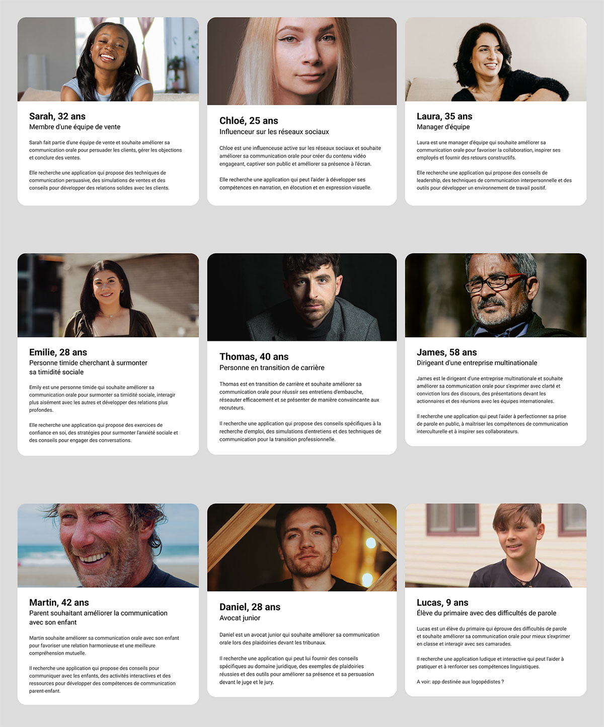
Personas
One of the key steps in user experience development, is personas. These could bring new perspective and fresh thinking on the table.
I've worked on a bunch of personas in order to guide my design decision and get the team on the same boat.
We worked with different personas throughout our development phases.
The diverging phase
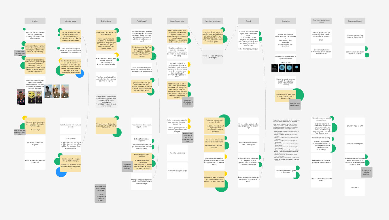
A ton of ideation went into this app. I really mean it, A TON !
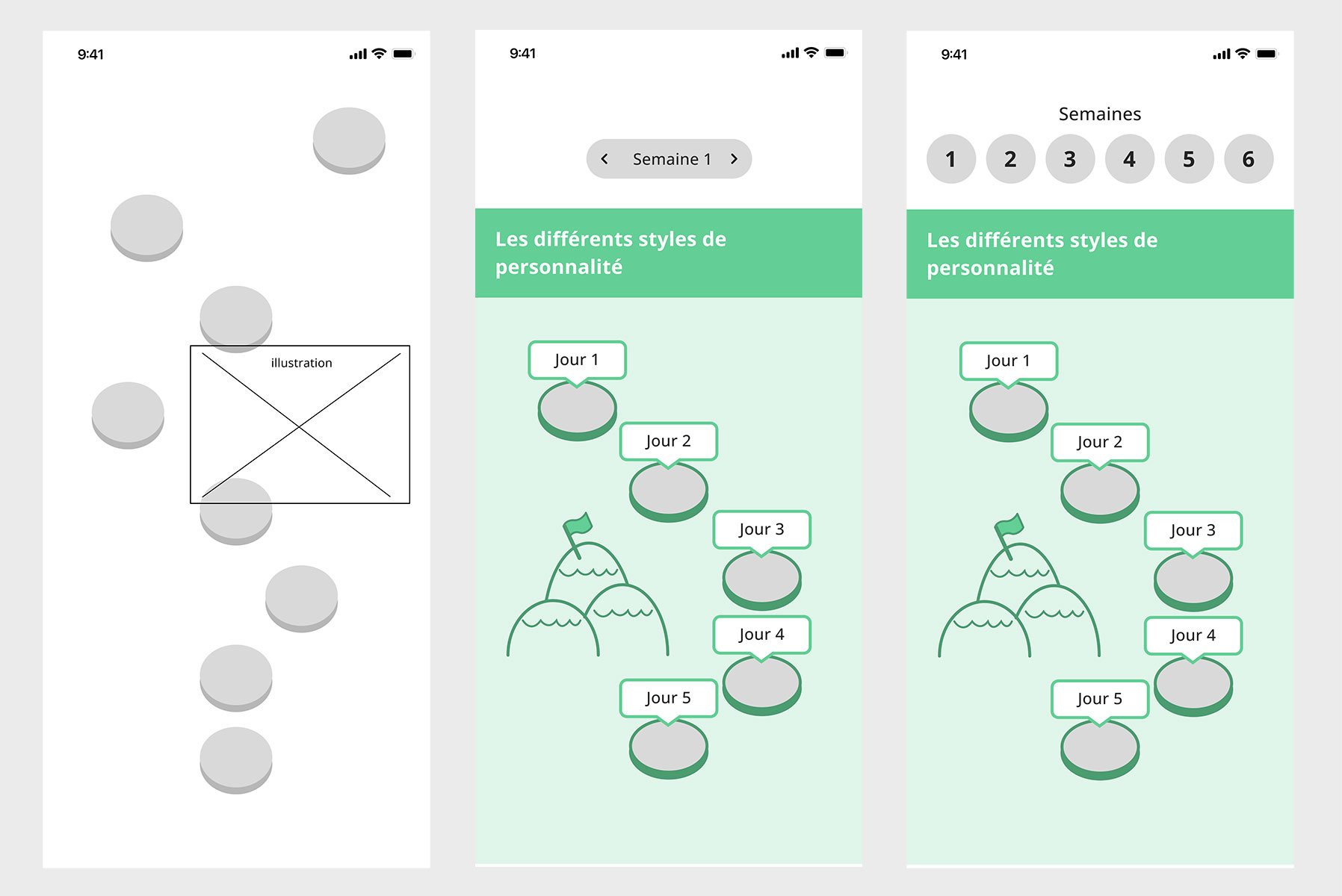
From high-level conceptual ideas, to sketches, wireframes and prototypes, the amount of possibilities are literally infinite..
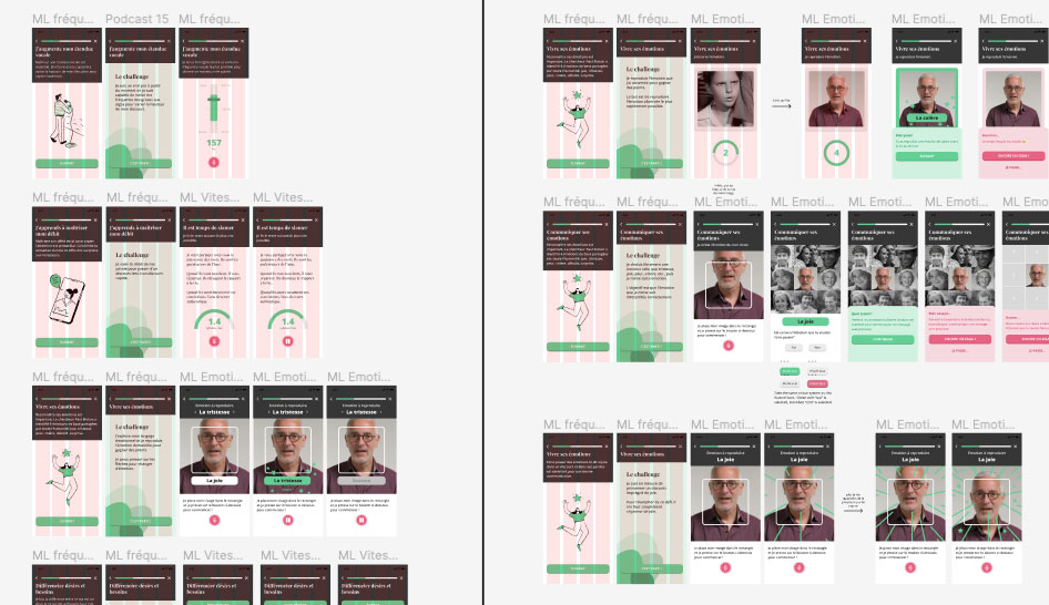
Here's a picture of a high-level Figma document that we use to collaborate in ideating new micro-learning to implement inside the app.
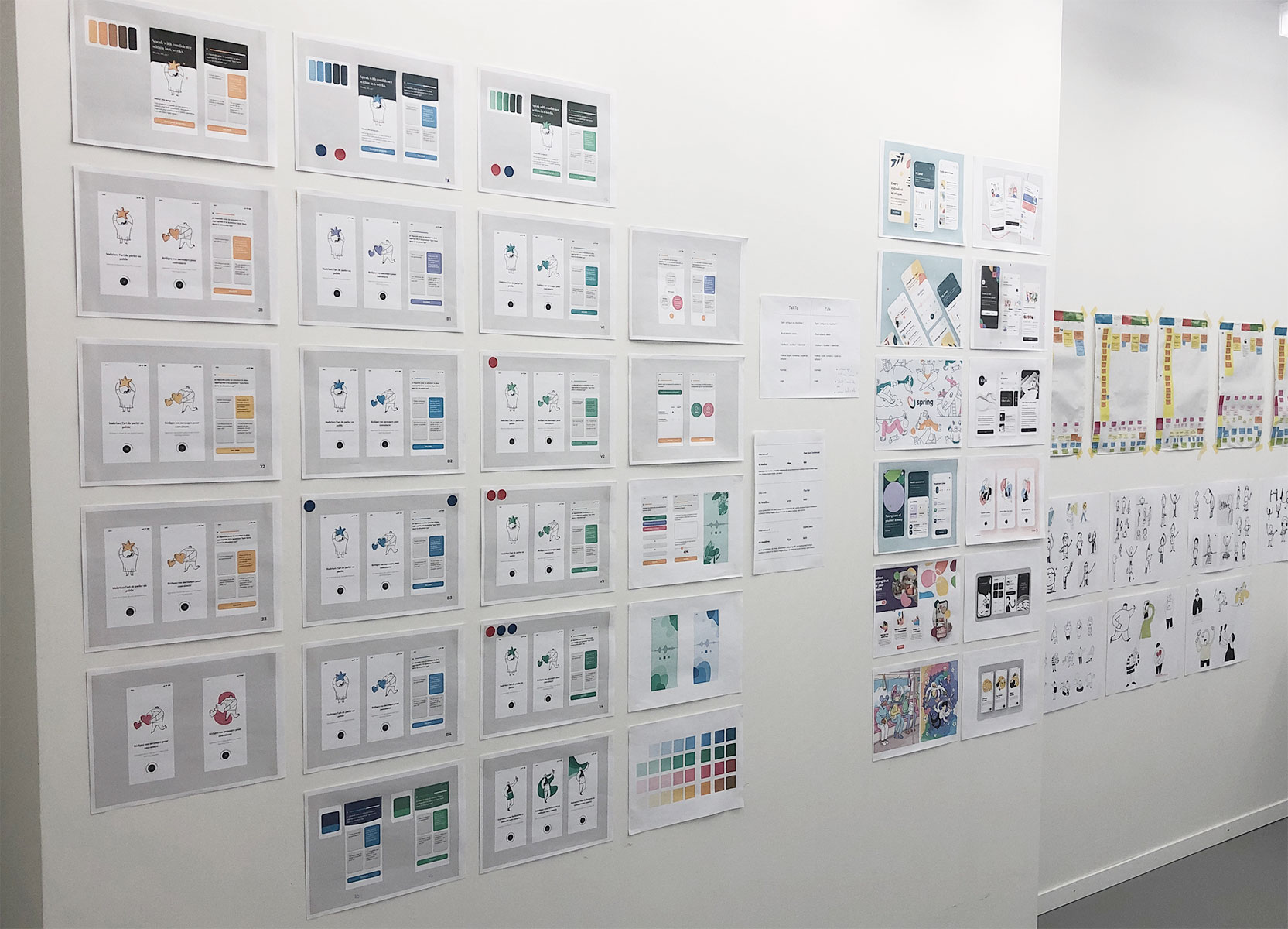
Kickstarting & launching the new app design
It took quite a bit of work to ideate, create and evolve the beginning of the Talk mobile app user experience. It was during this step of the process that we got direction in where to go on the design and experience side.
Final designs
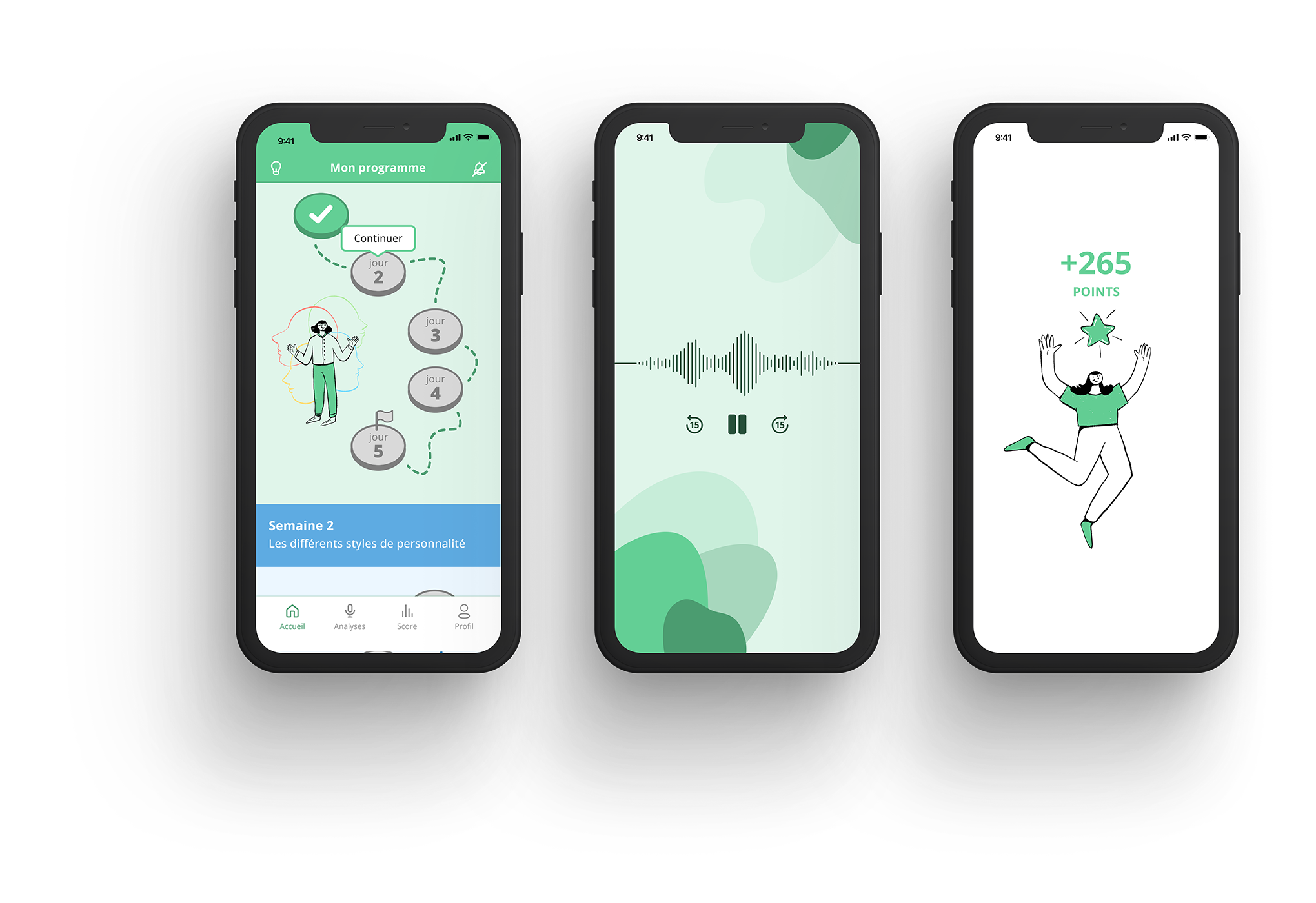
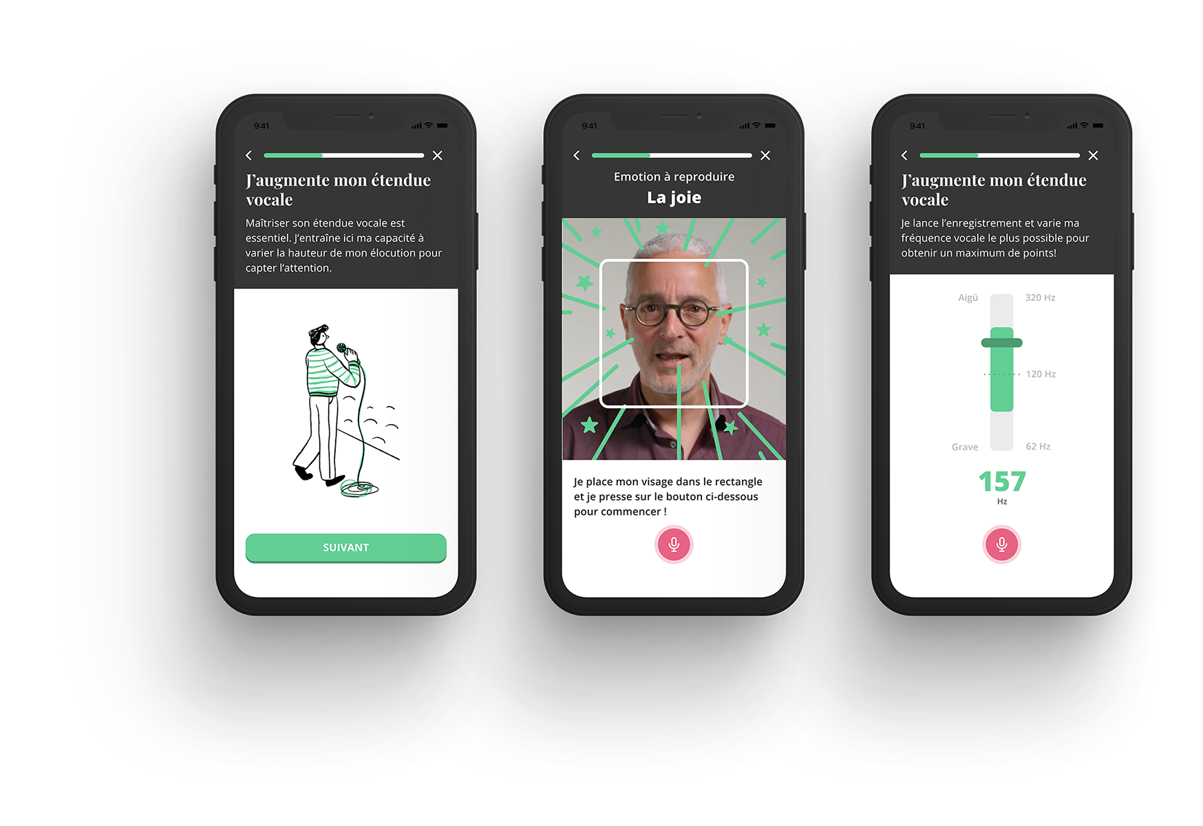
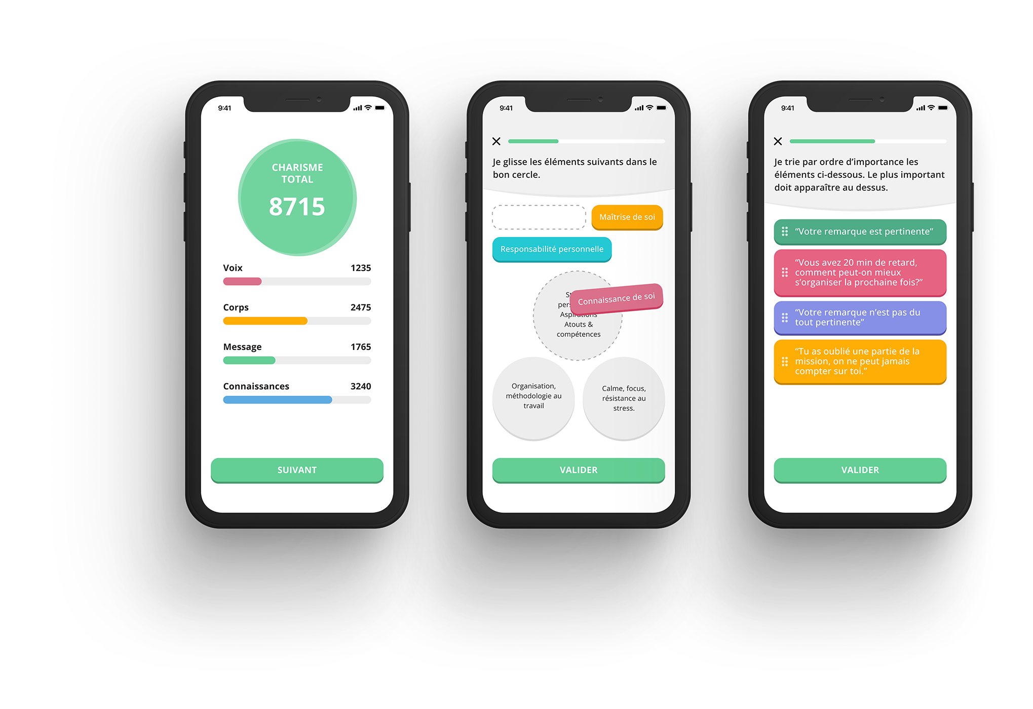
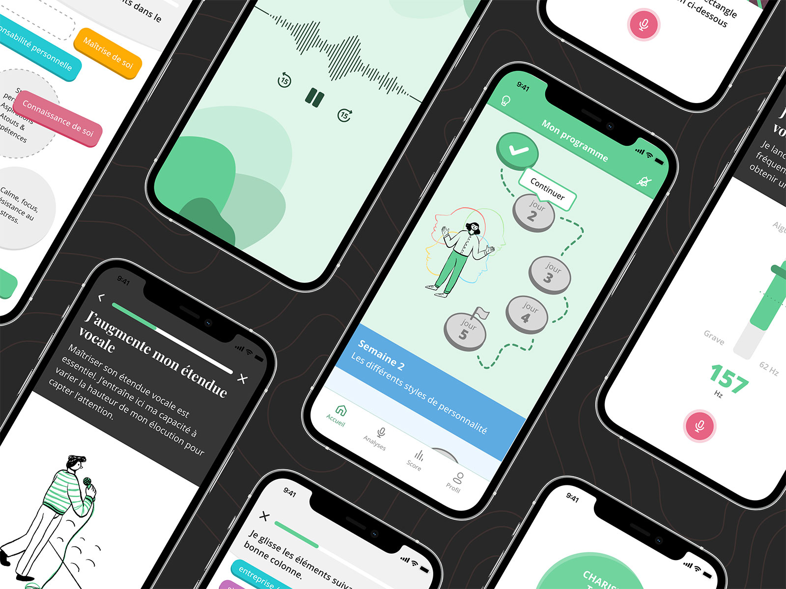
Here is a selection of a couple of screens that I've made in the last few months.
Don't hesitate to contact me if you wish to know more about my work and how I can help you.
